Eyecan


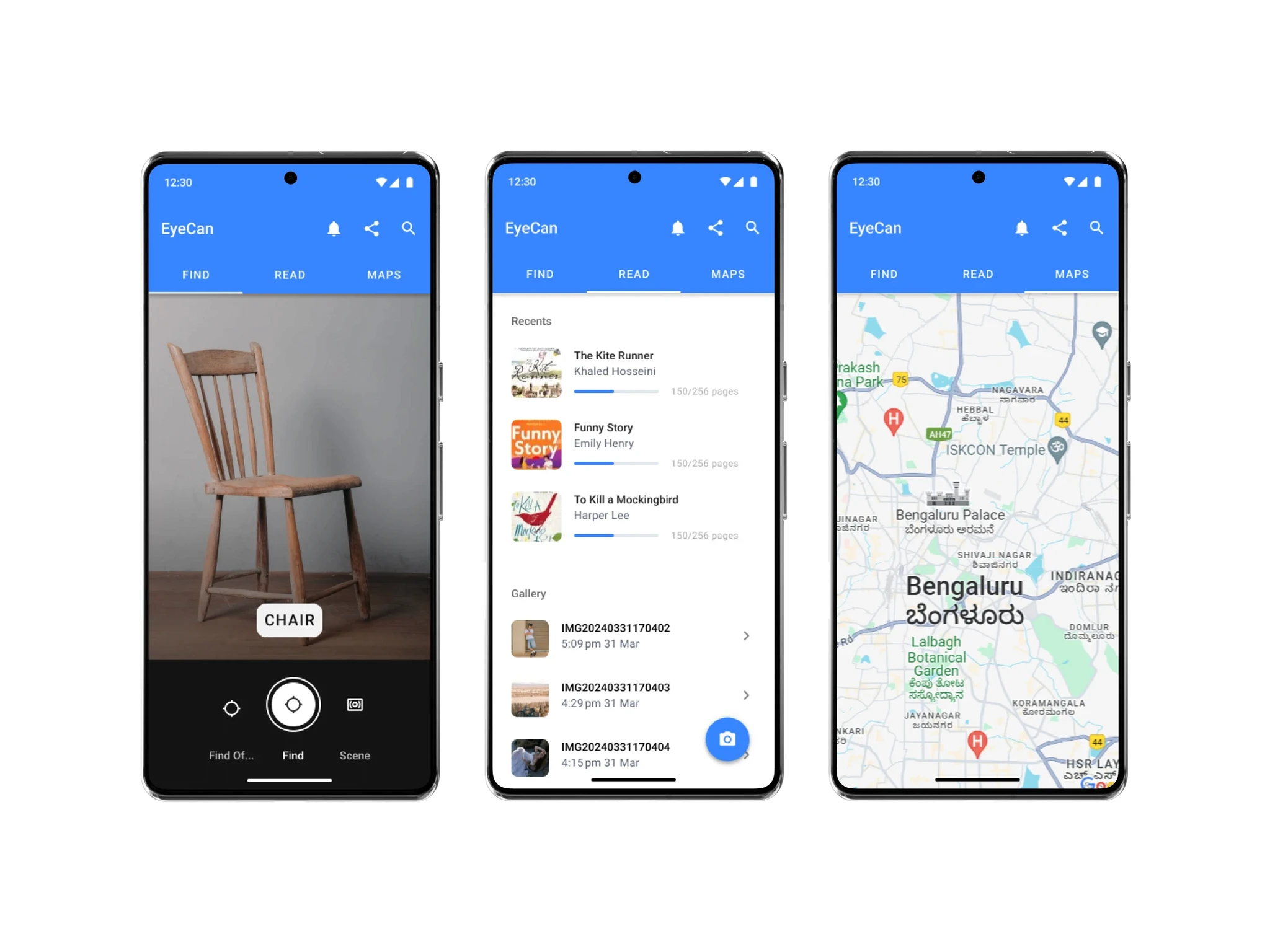
Empowering Independence: Eyecan Pro is an assistive app designed for blind and visually impaired users, offering a set of digital eyes to help them read, locate objects, and explore surroundings independently.
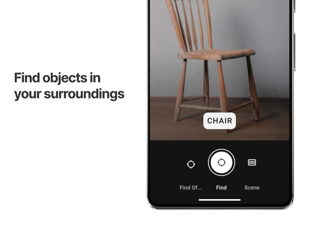
Key Features: The app includes GPS navigation, real-time OCR for reading, document scanning and exporting, object location with audio descriptions, and exploration tools in Hindi and English.
User-Centric Design: Developed with feedback from visually impaired stakeholders, Eyecan Pro features full talk back support and plans to include multiple regional languages for broader accessibility.
Community Engagement: Users can connect with the Eyecan team at support@eyecan.in for feedback and suggestions, contributing to the mission of empowering visually impaired individuals through AI technology.
The target users of the Eyecan app are blind and visually impaired individuals. The app is designed to empower them with a set of digital eyes, enabling them to read, locate objects, and explore their surroundings independently. It offers features like precise GPS navigation, real-time OCR for reading texts, hassle-free scanning of documents, and detailed audio descriptions of the environment, all aimed at fostering independence and inclusivity for visually impaired users.
As the development team had taken on the design responsibilities, they encountered difficulties in ensuring that the app was both visually engaging and adhered to standard design patterns for this specific type of application and its use case.
The decision was made to incorporate a tab pattern for each primary action of the app drawn from material design, coupled with a standard camera pattern commonly employed in analogous apps, such as Google's Lookout.
Enhanced User Experience: The tab pattern provided a clear and intuitive navigation system, allowing users to easily switch between the app’s primary actions.
Increased User Base: We acquired 9000+ users in first 3 months Beta release.
Consistent Design Language: Adhering to material design principles ensured a familiar and accessible interface for users.
Improved Accessibility: The standard camera pattern facilitated a more user-friendly experience for visually impaired individuals, increasing user retention by 20% while aligning with the app’s goal of aiding this demographic.
Streamlined Functionality: These design choices contributed to a more efficient and effective app, increasing user engagement by 25% and enhancing overall user satisfaction.